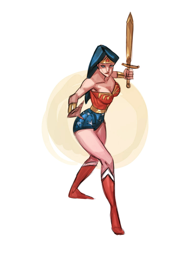
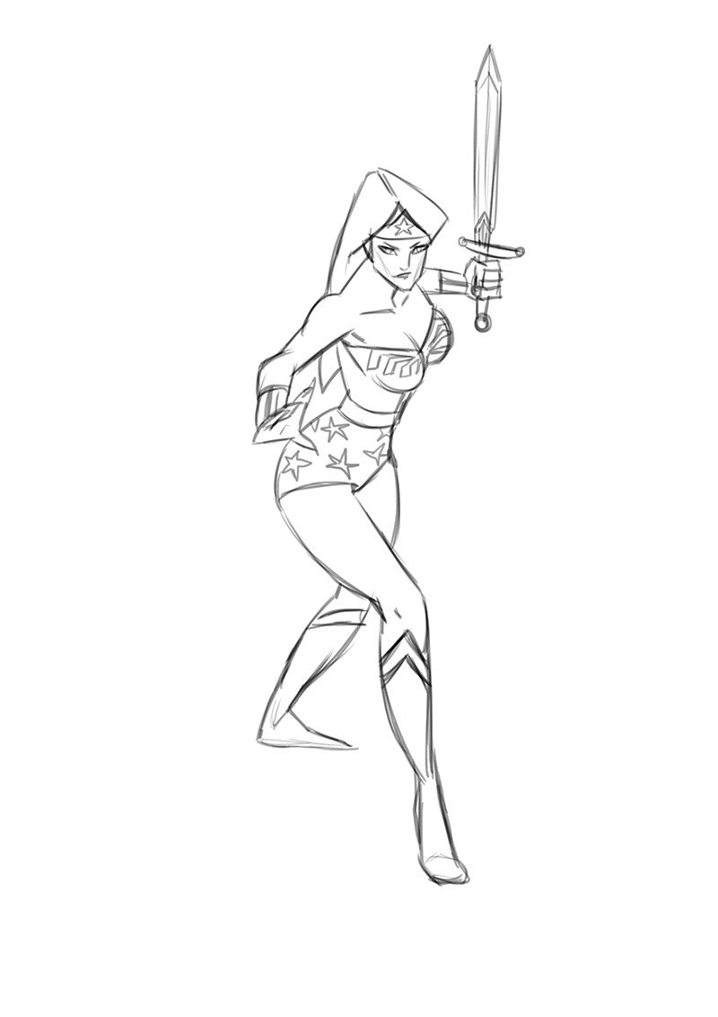
I think that this will be the sketch I'll donate to the Dublin Art Auction, original art A4 with a HB pencil. You can find info about the auction HERE.
No borders version:
Friday, September 26, 2014
Tuesday, September 23, 2014
One Piece Pencil Illustration + Steps
This was done for a monthly draw off challenge on penciljack. This month's topic was "One Piece", I read some of the manga but never got into the anime. But for research sake I skipped to episode 80 something where we are introduced to Chopper, and he quickly has become one of my favorite animated characters. Anyway, I wanted to do a pencil drawing to challenge myself and this is the result:
One of the things I didn't really think about was how to use tone to strenghten the composition. There were also some problems with some characters being too small or too big, but overall really had a lot of fun drawing this.
Below is the rough pencil stage before I cleaned up and toned in the drawing: I used a HB pencil on an A3 pad.
Below is the cleaned up version:
I then tweaked the levels and sized down "Chopper", he was really too big and messing up the sense of perspective..especially since Nami (the girl with the stick) is much smaller than the characters in the foreground. I finally flipped the image since I think it looks more dynamic...something with how we read a page from left to right.
Saturday, September 20, 2014
Let's bring it back
I've been getting a bit frustrated as of late with drawing, because even though I'm (probably) better than let's say last year, I still don't draw anywhere near as well as I'd like to. But learning to draw the human figure will be a life time goal, so I've decided to drop the focus on studies and go back to having some fun with drawing on this blog.
I've yet to decide what I'll be doing but it will either be in comic or animation form (or both). Most importantly it'll add some context to drawing figures. To kick things off, here's an old favorite of mine, my buddy "Skin"...Oh yeah, I pencilled it on paper to practice for a sketch I might submit for the yearly animation auction. Some amazing artists are submitting work this year, so try to attend and maybe snatch up a nice piece of artwork to hang up at home! I know I will :)
I've yet to decide what I'll be doing but it will either be in comic or animation form (or both). Most importantly it'll add some context to drawing figures. To kick things off, here's an old favorite of mine, my buddy "Skin"...Oh yeah, I pencilled it on paper to practice for a sketch I might submit for the yearly animation auction. Some amazing artists are submitting work this year, so try to attend and maybe snatch up a nice piece of artwork to hang up at home! I know I will :)
STUDY: One Piece
The deadline for the monthly drawing I need to do for this forum (penciljack) is getting close! The topic is One Piece (the anime), so I've been watching some episodes these last few days..I gotta say...skipping past the early bunch of episodes ( I jumped to episode 83 or so), I'm really getting into this show and its' crazy and weird characters.
Check out some of the dynamic angles in the show...that middle panel there is framed so cleverly. One of the things that sometimes gets to me on our show (Randy Cunningham: 9th Grade Ninja), is that the boardartist will often draw these super cool shots or poses..but the poses aren't held for long enough. Anime is known for having still images on screen while mouths are flapping, but when the shots look as cool as this...it works really well.
Anyway here are my doodles..in reality I was just watching watching cartoons, but it sounds a hell lot more sophisticated when you call it 'studying'
Thursday, September 18, 2014
Wonderwoman Sketch 2
Alrighty, here's another attempt at some more stylized anatomy using good ol' Wonder Woman:
Now..the story behind the image...I basically realised I was taking too much on my plate at the same time. Trying to come up with a pose is a challenge on it's own, drawing anatomy on top of that pose is another challenge, and stylizing anatomy is yet another complete horse.
So when I sit down with an hour of sketchtime trying to do all of the above, I really shouldn't be surprised that the end result is crap. So...to remedy that I will start of my sketches with a reference! That means that the pose is already there, I just need to apply anatomy and think about shape and design.
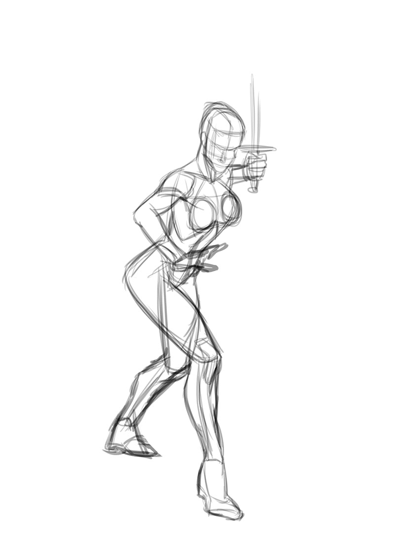
What I did was draw a loose gesture based on the reference, then got rid of the reference and started filling in the anatomy based on that gesture...I might actually keep a reference at hand during the entire process next time because it started out very messy:
1) This is my bare bones skeleton shorthand:
2) Then drew the top level anatomy...you can see however the pose is all sort of weirdness by the time I got here.
This was going to be the initial shape layout for my sketch...but I noticed how unbalanced the whole thing was so redrew it ...the result is the sketch on top...anyway..this is a pretty tough exercise, but I definitely recommend it for people who want to test their knowledge of the human figure.
Wednesday, September 17, 2014
Wonderwoman Sketch
So I finished the last class of the anatomy course I was doing today. Now to go back and go over the material until it all makes sense :)
Also going to try and implement shape design into that anatomy, which will be the hard part. I don't want to be full on graphic..but find a nice midway point between realism and design. Probably more leaning towards how the japanese draw figures for action anime.
Here's a rough sketch of wonderwoman trying to do exactly that...like I said..it's going to take a while...(I also need to learn about proportions...it's often something that bites me in the neck...expect some more Loomis studies on my figure drawing blog soon! :D
On a sidenote..no reference used. I started with a skeleton and did some anatomy on top (posted at the bottom of this post), I changed the pose quite a bit though for the sketch below:
Monday, September 15, 2014
Luffy D and Chopper sketch - One Piece
Prepping for a One Piece drawing I'll do this month for the forum challenge I participate in.
Lineart
Here's the flats and the original thumbnail
Lineart
Here's the flats and the original thumbnail
Zombie Sketch
Once again drew a couple of figures from imagination and then turned one into a zombie
Basically just drawing anatomy from imagination to practice
I drew on top of it but I really don't like the result, too much detail and not enough focus on the figure as a whole. All the detail of the muscles is something that should be painted with color or maybe drawn super light, so the main shapes still read clearly. Right now everything just breaks up the shapes. I also need to learn how to draw clothes and work on drawing hands :D
Thursday, September 11, 2014
Wolverine Sketch + other disasters
Ok, so let's get the good sketch out of the way first (or at least I think it is at the time of posting)..
I am suffering form a severe case of "is this crap...maybe it's really crap and I just don't see it". I also have reason to think like that..because a lot of times I look at a drawing after I'm done and I see how wrong it is...sometimes, it's proportions, sometimes it's the pose, sometimes it's shape design..and sometimes it's all of the above :P
But you know, I'm not getting paid to draw in my spare time, so as long as I enjoy the process, I'm happy. I honestly just like moving line across surface...if a good drawing shows up at the end, it's a nice extra :) Anyway, below is a wolverine sketch...scroll down if you want to see how it came to be,
So I started off with a sheet of poses...I'm honestly seeing improvements...but it's not an easy journey..these are all from imagination without reference:
So I picked the 2 poses below:
I thought the first one was a good base for Colussus...I drew it and as soon as I zoomed out I noticed how crap it looked :P I think the small gesture looked good, but clearly the proportions don't work...that aside, I am happy with the form and shape of the anatomy.
The thing about drawing 'realistic' is that you can't get away with much, it's either right or it's not...
So I then took the second pose as a base for Wolverine, I drew a bit looser to get some energy into the sketch, colored for the result you can see on top.
Below the other sketches Blown up a bit:
And a page of some INOUE studies from his manga Vagabond:
Sunday, September 7, 2014
STUDY: INOUE Takehiko - Vagabond
August was a tough month, I didn't get the time to work on the Red Sonja script, but since I can't submit it for the forum challenge I can now take my time on it and really push myself on it...just hope I don't get lazy and just forget about it :D
Anyway today I want to shine the spotlight on artist Takehiko Inoue, I have been looking for an artist to study who draws anatomy well but draws in a style that appeals to me. I found a manga by Inoue Takehiko called Vagabond. To be honest his artwork really starts to shine in the later chapters where he really loosens up, to me his drawings remind of the work by Bridgman in his anatomy books. It's dynamic and sculptural..exactly what I was looking for!
Here's a video with the man and his work:
Here's some of the pages I filled...last page probably the most interesting (to me anyway).
Thursday, September 4, 2014
Figures - Wolverine style
I'm far from done with anatomy, but I also want to start working on shape design within my figures. Because in the end all of this is to strenghten my core skills as an animator, not to become a heart surgeon :D
Here is a sheet of some figures from imagination, trying to incorporate some shape & design. This is where I really need to start looking at other artists to see how they solve "the problem" of shaping out anatomy.
Took one of the sketches and fleshed it out into this...an exercise in applying anatomy.
Tried to flesh out another pose from the sheet....but a) It's a hard angle and b) I started to draw too detailed to quickly again.
Below is a sketch I did the previous night, I kinda hate it because the shape design is not very successful(neither is the pose) but at the same time I do like the linework the color palette.
And another figure from imagination..the placement of the head kind of kills this drawing, but fairly happy with the stretched leg.
Subscribe to:
Comments (Atom)


