Saturday, May 24, 2014

People Sketchin'

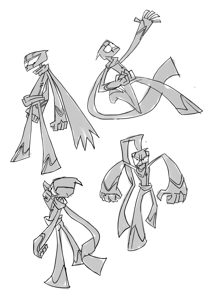
Went people sketching today, you can find the drawings on my other BLOG. I had a pretty bad headache, so between sketching and trying to formulate some sketches, I had a hard time focusing. Luckily you always get a second chance at your drawings, so when I felt better I re-drew some of the drawings in Photoshop and try to push the designs a bit:


Thursday, May 22, 2014

STUDY: Rival Schools by Edayan

I want to do at least 1 study a week, no excuses :P

Let's kick off with some of my favorite artwork from the Capcom fighting game, Rival Schools (on the ps1). The original art work is by Edayan.

AIM:
The aim of my studies is NOT to replicate the image perfectly. I am not a copy machine. I only want to try and investigate how an image would be created and what tools I could use to create something similar in style.

Ok, here we go!

1) Sketched out the shapes, and I highlighted the negative spaces, because I am quite conscious about them while I am drawing. I actually drew the ball too small and as a result the figure is also a bit more squashed than the original :P


So I then sketched the linework, I am investigating where overlap is drawn to clarify muscles and folds in clothing.  In some way it kind of reminds me of Bridgman's drawings, it's quite sculpted.

Using the same brush I use to sketch, I just added a texture in the brush settings in Photoshop. And played around with the "flow" option to get that painted look:

And that's it. Of course it's quite sketchy, if this was my own drawing, I'd clean up the paint around the edges, and create some hard and soft edges, but for this quick study I was quite happy to leave it at this.

Randy Cunningham sketch

I'll get back on track with some more serious work again soon, it's nice to just doodle once and a while though. At least it's some form of keeping the daily grind going.


Randy Cunningham in a .. more...realistic? Style? He's pretty cool, I wouldn't mind throwing a little animation together with highschool Randy facing off against the venom...because..Randy = Peter Parker.

Here was another less successful experiment:


Saturday, May 17, 2014

Street Fighter x Randy Cunningham Sketch

This is based on a drawing that Claire from work did of Randy & Howard as Street Fighter characters. I liked it so I sketched them in action:


Sailor Howard!

The theme for the workblog this month was Fairies.... I always wanted to drew Howard as a magical schoolgirl so this was the time to do it! :D


Original before text and color touch up:


I'm not really good at drawing toony or cute stuff, so this was kind of hard.
The inspiration image was from Sailor moon:


Tuesday, May 13, 2014

Randy Cunningham Sketchdump

All the sketches below were done for my new secret Randy Cunningham fanart tumblr.

Street Fighter x Randy


Ninja Doodles using posemaniacs on 90 second random poses:


Ninja doodles without reference:

Ninja doodle colored!


Wednesday, May 7, 2014

ART TRADE with Stefanie Reville + WIP

Here is my part of an art trade with Stefanie Reville, who's beautiful Yuna piece you can admire just below. Please check out her blog for more awesome artwork LINK


Artwork by Stefanie Reville (  LINK )

And as always for those who are interested I have some work in progress breakdowns:

1) Thumbnail: As you can see I immediately worked out the greyscale, I wanted the composition to revolve around the wizard character in the middle.

2) ROUGH: More fleshed out Thumbnail, I added paws to the dragon to frame the composition better, but since I didn't want to spend a lot of time on this drawing I decided to leave it out (call it being lazy).


3) Line Art : Speaks for itself, no idea why I dropped blacks on the wizard since I decided from the start I would paint this.


4) Since most of the image would be the dragon, I decided on the color for it first and then painted in the sky.


Skip ahead a bit and you can see I was just using a darker version of the green to block in the shadow.


At this stage I still didn't paint any highlights (apart from the red eye), I just changed some of the colors on the wizard and painted in more refined shadows.


When I was happy with the overal image I then started painting in the highlights (lighter parts).


I passed it on to my buddy Eddie jensen to have a look at quick fixes, he pointed out the double hat looked kind of strange, and a lack of something on the left to guide the eye around the painting. I remedied both in the final version and also tweaked the final colors a bit.