This is actually another concept for that comic challenge, this time just going for straight down poses, what a team right? Venom , Carnage AND black spidey! Yeah, you don't wanna mess with them! Haha
I don't normally sketch digitally, but with digital animation down the line I just have to force the habbit, nothing like a cintiq though right? Damn, somebody please give me one of those beauties, I bet you there's 5 year olds who have cintiqs to doodle on. Why didn't I get the rich parents?
Another update: It's great to attempt things you're not capable of...even if only just to realize what your weaknesses are and what you need to work on. I'm definitly not knowledgable enough to draw oversized bulky masses of muscles, but reassuringly I found lots of venom pictures on google that are just off. In the end the only task we have as artists is selling an idea to the normal people, if they think it's cool. Job done!
more
Wednesday, June 30, 2010
Challenge 1
This is for a challenge against another comic artist, although I think I'm not going to finish and draw something a bit more dynamic rather then relying on poor dialogue. It was good to experiment with a different style though, I choose to draw thin lineart and make the colors speak for themselves (coloring not finished though).
the organization that isn't
Remember a while back I drew a redhead girl with a giant glove, well she's gonna be a character for a comic on drunkduck. Check out the comic, it will be launching soon and it looks like a lot of fun!
This is his redesign of my character in his style:
Totally awesome right? Anyway here's the link
This is his redesign of my character in his style:
Totally awesome right? Anyway here's the link
Tuesday, June 29, 2010
Jedi scumbags
Monday, June 28, 2010
Hulk vs Wolverine WIP
I knew when I draw my morning sketch of Wrex that today would be a crappy day for artwork, and I was right. I've been struggling all day and I ended up in this digital painting of Hulk vs Wolverine which is going nowhere. For me everything starts from a solid drawing, that's why I can't do any digital paintings because I can't get a grip on what I want to portray.
But! Let's not put our heads down yet, because we just need to get going, get past this let down and get back on track! If not today, then tomorrow!
Sunday, June 27, 2010
todays sketch
Night sketching
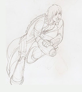
I wanted to draw something before going to bed, so I bugged one of my buddies to do some sketching with me and we decided on mixing megaman and dante together as one character. So here's the result, I put a little step by step for beginners who are interested to see how I create my work. Bear in mind I did this in an hour from concept to finish, so obviously the more time you put in your work (especially the foundation of your image) the better the result will be.
1_draw a sketch.
I always draw my sketches on paper, I just can't get into drawing on the computer, I don't know why, but it just doesn't work for me. Maybe one day when I can afford to buy myself a cintiq, it'll be different, because that feels more like sketching on a notepad, but untill then...
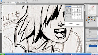
2_start inking
Scan in your drawing and open it in photoshop (or any program you like working in), I use the standard brush in photoshop with my tablet for pressure sensitivity. I draw at 200% because I suck at drawing straight lines, so the more zoomed in you work the better, because you wont be able to spot the shakey lines when you view it from far. When you have nice long curved lines though, you might want to zoom out and draw from the shoulder.
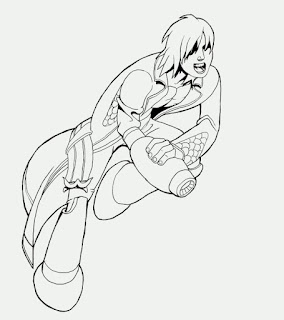
This iis how my image looked inked: Try to use thick and thin lines to show depth in your drawing. I actually ended up drawing a thicker line around the cannon arm because it's the closest to the camera.
3_Flats
Now it's time to fill in your drawing with flat colors, you can use the lassoo tool if you want but I prefer to just usea big brush and color everything thing in manually.
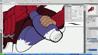
this is the result
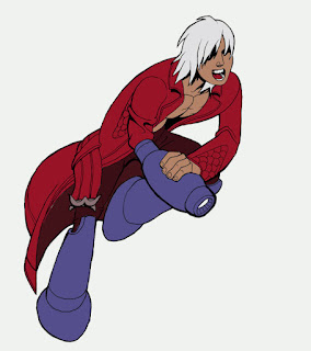
4_Shading
Now its time to draw ontop of your flats and add some 3dimensionality. You probbaly already picked a lightsource when you were inking, so stick to that and make sure the shadows all come from the same source. When adding highlights you need to concider where you want to guide your viewers attention to. Thats where the highlights usually will be stronger. I used to make a big mistake of using highlights everywhere.
If its a sword it has to be shiny right? No..if that sword is in the background it needs to stay subdued or it will distract from what's happening.
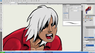
and there we go, finished! This is a simple drawing style which suits quick concepts and comic art. If anybody wants more in depth information, don't hesistate to ask me.
Tuesday, June 22, 2010
more comic art
More stuff for my summer project comic Unchained, trying to find the style of how I want the art to look like, I think I like the mix of inked characters with simple shading and a painted background. I can't ink backgrounds digitally anyway, the lines become all shakey and I refuse to use the line tool because that would make it look too perfect.
Here's how I worked on this image:
I first pencilled down the sketch and scanned it into photoshop.
I then roughed out where I wanted the blacks to be for the inking.
And then you start inking! I inked pretty closely zoomed in with a 4 px standard brush in photoshop.
One you're done with the inking, I always start coloring the background first, because the colours of the background will affect the colors of your characters.
For this is used the standard brush again with the pressure sensitivity on.
From looking at old Sinbad movies I had a colour palette in mind, and I keep it very simple because I simply don't have enough understanidng of color to go all wild with them :D
Monday, June 21, 2010
Sunday, June 20, 2010
Saturday, June 19, 2010
Wednesday, June 16, 2010
Sunday, June 13, 2010
Flash
Ok so I'm starting to play with flash, this is literally just a test to see if I can actually upload flash files to my blog.
Subscribe to:
Posts (Atom)