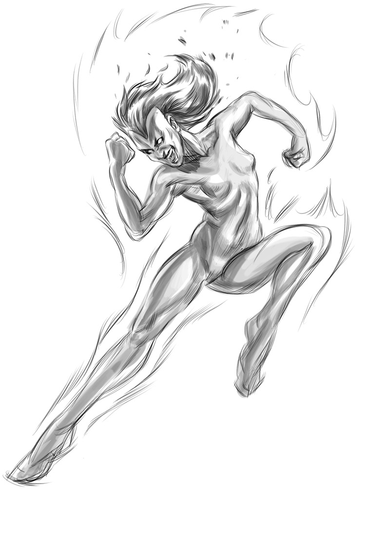
Drawing is... difficult sometimes...I should probably just draw standing poses, at least I know how to do those. This will be the visual style though for my Red Sonja comic next month.
Thursday, July 31, 2014
Tuesday, July 29, 2014
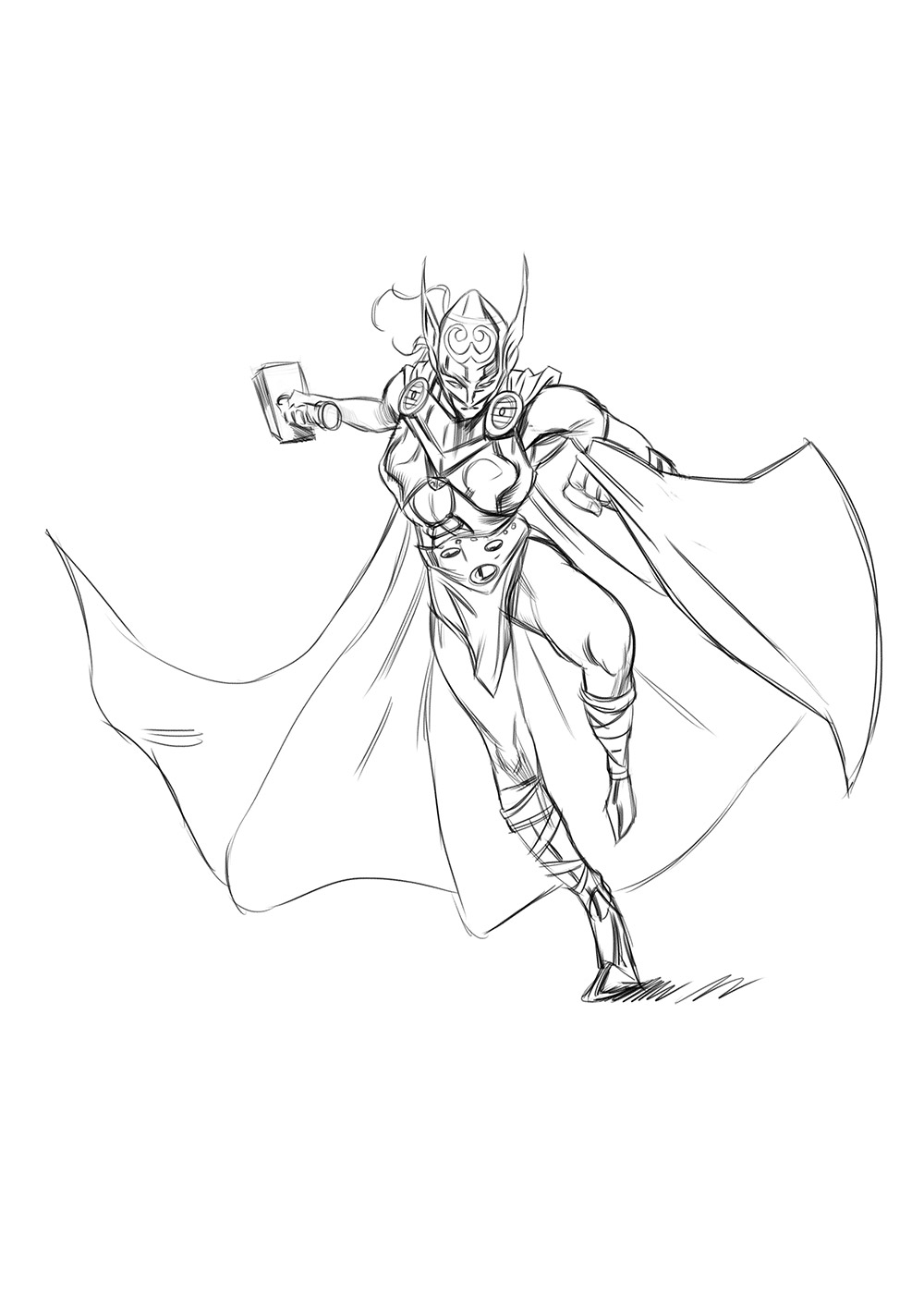
Marvel's New She Thor Sketch 2
I really need to stop sketching so much because I have way too many things to do :P
But I'm kind of having fun testing my current ability. The pose I drew here was not easy! As always I used no reference, I didn't quite figure out how that arm holding the hammer works. I tried my best faking it, so maybe to the untrained eye (including mine) this looks good? This kind of reminded me why I need to study anatomy, I just need to know how body parts connect into 3d space to pull a drawing like this off.
I really like the linework I did for this, you'll notice I am really trying to stop myself over-rendering anatomy, as a result it actually looks a lot more pleasing I think.
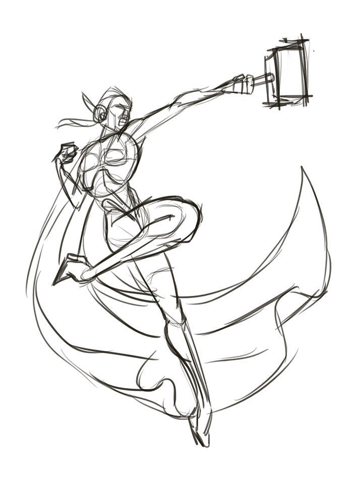
Beneath are the rough and sketch stage of the drawing..probably the most important phase, the rest if just fancy stuff to pretend you know what your doing :P
WSG: Thor - female
Here's a sketch of Female Thor, apparently Marvel is going to launch Thor's new story arc as a female. I'll definitely be picking this up if the art is any bit as good as the cover art I've seen on the web. Anyway here's my early interpretation of the character.
The lineart:


The lineart:
My initial sketches:

A bit more fleshed out sketches before I picked one, might try and do all of 'em:

Saturday, July 26, 2014
Boulder TV + Step by Step
At work they have a competition for a crew t-shirt and while I am probably the worst person in the world to come up with a "design" for a t-shirt, I didn't want to not to anything for it either. So I just drew something in my own style..and quite honestly it's one of my favorite things I drew in the last few months :P
I'll probably submit this for the end of year art auction instead of a t-shirt design. Anyway, here's the artwork and below a few breakdowns of the idea to final process. Probably took about 4 maybe 5 hours from start to finish.
(detail)
I have an original thumbnail I drew weeks ago, but I'm too lazy to scan it. But this is my digital thumbnail for it (which actually is quite different from the original).
This is the Rough Pencil stage, I moved the characters around a bit so it feels like a 3d space instead of 2d flat surface. I also removed spiderman, partly because I wanted to do this fast and also because I think he wasn't necessary for the composition.
This is the cleaned up linework, I always keep it kind of sketchy. I really don't like super clean artwork..I am flawed and so should my drawings :P
I had no idea how I was going to color this, but I decided to start of with some blobs of color to see if the silhouette was working.
I then decided my color palette based on the base color.
The rest of the process is very organic, the way that I color is the way that I draw. If you see any of my black and white drawings, I do the same but with color.
That's it for now. August will be a very busy month. I have a 5 page comic to do, an illustration for the monthly competition, part 2 of my anatomy course and if I get the chance I'm also doing the weekly sketchjams and of course weekly figure drawing. You can probably tell I'm the ALL or NOTHING type of person :P
Friday, July 25, 2014
Red Sonja Sketch II
I woke up early this morning so did another run on that Red Sonja pose, this time a more "stylized" version. I thought the head was too small so I made it bigger, but now it's too big :P I should really look into proportions at some stage.
Anyway, I'll be doing a 5 page Red Sonja comic next month, so I was thinking of coloring it using this kind of sketchy style with flaming red hair. It's been done a lot before but can't argue red on greyscale always works wonders.
Anyway, I'll be doing a 5 page Red Sonja comic next month, so I was thinking of coloring it using this kind of sketchy style with flaming red hair. It's been done a lot before but can't argue red on greyscale always works wonders.
Red Sonja Figure Sketch
Been a busy week focussing on getting my animation done for work, so less time for figure drawing. But to close out the evening I did a figure from imagination..no reference... unfortunately I need to get up early tomorrow so no time to finish the drawing up.
Self assessment: Still have issues connecting the head with the body...definitely still need a lot of work on the head area. It's also missing a bit of meat coming in on the ribcage under the armpits :P
Self assessment: Still have issues connecting the head with the body...definitely still need a lot of work on the head area. It's also missing a bit of meat coming in on the ribcage under the armpits :P
The original drawing actually had more attitude, don't know why I changed it during the tonal version.
Tuesday, July 22, 2014
Marvel Valkyrie + Character Sketches
For a weekly sketchjam I did some sketches of a character I never heard of: Valkyrie. To be honest..superheroes are super easy to draw since all of them just wear different "bodypaint"..but most of these characters are all built the same way.
This is all part of the drawing "poses from imagination" exercise. No reference used. This time around I tried to focus on general shapes instead of fleshing out realistic anatomy (which I very rarely succeed in - but it's a great exercise).
I tried some different styles, but I'm sure to the byepasser it all looks the same. If you look closely though you'll see some of the figures have very little definition in muscles (with extremely long legs) while others have more anatomy defined . It's very clear that realism is much harder than suggestive drawing. I guess in some way or another this eventually will lead into style...but for now, just looking out for gesture, weight and silhouette.
Below the initial gestures before I fleshed them out roughly. If I get time at some point I would like to take a few and finish them.
Sunday, July 20, 2014
Red Sonja Sketches + Heads
Nothing more relaxing than slouching in the couch with a sketchbook and watching some movies. Finally saw the LEGO movie! Yay.
Anyway here are a few 'standard' heads from imagination..it's all about trying to get some structure and rotating them around in 3d imaginary space. I think my up and downs are looking 'better' anyway than before my Loomis studies...will get back to heads after my course finishes up.
OK, and here are the 'throw away' sketches. I'm just posting these up so fellow artist noobs looking for knowledge on how to get better can see what my studies are:
(Left) Looking at some John Buscema...that man mastered the figure. I'm especially a fan of his work on Conan.. his poses are powerful and clear, and he uss line perfectly to suggest form without making his figures look stiff. I'll have to properly delve into it one day, but not with biro...I think an actual brush and ink is needed.
(Right) Jim Lee: Still my number one go to guy to doodle poses from, Another guy who is a master at drawing the figure, and I'm yet to find a comic book that packs more dramatic poses than his 90s X-men stuff.
And here are a few lazy pages doodling poses and (horrible) faces from 'Red Sonja'. Gotta say that Conan is one of my all time favorite movies..Red Sonja...is acceptable :P
Thursday, July 17, 2014
Sailor Moon Sketch..
Another sketch for that forum, theme "Sailor Moon", don't know why but I really dislike it..maybe it's the head
Tuesday, July 15, 2014
Battle Angel Alita Sketches
Wanted to do a sketch for a sketchjam at penciljack.com. So I drew 3 figures from imagination as a base:
I then defined the figures more:
I then picked one for "finish"(..sloppy and quick )..but it didn't really come out well at all...I think I drew the torso and hips too close together, the torso should also lean forward instead of back...just makes the head look awkward on top...ah well! Another one to add to those 1,000,000 bad drawings we need to get out :)
Monday, July 14, 2014
Figure Drawing from Imagination
I wanted to squeeze out some figures from imagination without reference, kind of trying to remember things I've drawn... but most importantly looking for that "inner artist"....trust yourself, enjoy the experience of putting down a line on a page..and try to block out the "thinker" who approaches everything in a mathematical, self aware and insecure way.
Dudes...I think these 3 drawings below or some of my best efforts so far when it comes to drawing believable figures from imagination. If you scroll down you'll see my first page...I think you can see the struggle, and as I got looser the figures started to get better as well. I actually only spent 30 drawing but I did warm up with gestures earlier.
Maybe tomorrow I'll look at these and hate them, but as a wise person once told me " live in the moment". And I think I'm getting somewhere with my recent hard work when it comes to studying figures.
Sunday, July 13, 2014
NOVA (Fantastic Four) Sketch + Jim Lee studies
Here is a sketch of a character called Nova (no reference), did it for a weekly sketchjam at Penciljack. Remember I said to draw from within a few posts back...this is basically what I did, not concerned about anatomy or or anything, just feeling out the drawing...I'm sure it's completely inaccurate anatomy-wise, but at least it has some energy and dynamic.
I also did some studies of Jim Lee, I found one of the old Uncanny X-men collected books in a second hand store. He's really great at drawing dynamic poses and...Psyloche...god dang does he rock that character!
I also did some studies of Jim Lee, I found one of the old Uncanny X-men collected books in a second hand store. He's really great at drawing dynamic poses and...Psyloche...god dang does he rock that character!
Undead X-men: finished piece
I say finished, but we all know nothing is ever finished, but I've got a lot of other things to do so calling it done here. I hope it's not too dark...
Definitely recommend watching this full res HERE. I created this as a comic cover, so the space on top would be for titles.
Definitely recommend watching this full res HERE. I created this as a comic cover, so the space on top would be for titles.
Here are 2 previous stages:
Subscribe to:
Comments (Atom)


